Wednesday, 9 December 2009

Evaluation Podcast script

Alice Bunting and Elizabeth Millar

Final Evaluation of Products.

1. How did you use new media technologies in the construction and research, planning and evaluation stages?

Lilly: A major new technology that we used for our research was the internet. The internet enabled us to research music videos of a similar music genre so that we could identity the generic codes and conventions of the dance/hardcore genre, which were Fast paced editing, a strong narrative structure and a leading female vocalist which we filmed using close up shots and tracking camera movements so the audience could connect with her.

Alice: Some specific videos that we looked at were ‘ Pretty Green Eyes’ by Ultrabeat and ‘ Now Your Gone’ by Basshunter. Some other new technologies that we used were ‘Imovies’ 09, ‘blogger.com’ and the mac computer. The new digital technologies such as the Mac computer were a key structure within our portfolio units. This Contrasted from foundation portfolio, where we were not able to develop our media products to a high standard due to lack of knowledge and experience with the Mac. Imovies was an essential new technology that we used within both units. As a group we used ‘imovies 09’ which was much more advanced software than Imovies 08’ due to better software.

Lilly: For example due to the genre of our music video the tempo is very fast and the conventions of the genre in the music videos to match the tempo of the song with very fast paced editing, so that it goes with the tempo, similar to the video Styles and Breeze’ Amigos’, which we wanted to reflect with our editing. Therefore the ‘Imovies 09’ enabled us to speed up the dance scene for our artist which meant we were able to be more creative and helped fit within the tempo of our song choice ‘Walking in the rain’, by Sublime.

Alice: Another creative feature from ‘Imovies 09’ was adding Filters , such as Sepia onto a specific scene onto the flashbacks, which helped us to break up the footage. This allowed us to apply the theoretic concepts ‘Uses and Gratifications’ in practice for our music video. The filter Sepia helped to engage our target audience as the effect helped them to understand the narrative as the filter Sepia connoted the flashback effectively, helping to achieve a more personal relationship between the artist and the demographic audience.

In what ways does your media products use, develop or challenge forms and conventions of real media products?

Lilly: During research, we found a lot of the models on the CD covers and posters video’s analyzed were in skimpy outfits which had high sexual connotations to the demographic audience, this was intensified through things like the models pose and expression. Therefore whilst creating our CD cover we reflected this through the choice of our original image, whereby the models pose and costume was had high sexual connotations and the setting reflected the stock setting of a club with neon lighting.

Alice: We also followed codes and conventions whilst producing our music video where we found through research was a strong narratives a typical convention of the dance/hardcore genre. We found we could apply todorovs narrative theory of Equilibrium, Disruption, Recognition, Seeking to reestablish equilibrium and finally Equilibrium to our music video. Breaking down the narrative structure of the video we can prove that we had conformed to the conventions of a typical Todorovian narrative structure.

Lilly: The equilibrium was where the artist is upset an alone.

The Disruption: was where the artist sends a text message to her boyfriend of the breakup.

Recognition was where the arist seeks to overcome the breakup and begins to get ready for a night out.

Seeking to reestablish was where the artist dances down the road.

New Equilibrium is where the artist winks at the camera which lets the demographic audience know she is Ok.

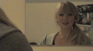
Alice: ‘Walking in the rain’ which meant it had a strong structure and the demographic audience would easily be able to make sense of the narrative. We also used a stock setting of a bedroom which helped the demographic audience connect with the artist as they were able to relate to such a personal setting and this also helped the audience to connect with the artist on a more personal level.

Lilly: One code and convention we have decided to follow is the colorful nature of the music genre; during research we found that CD covers and adverts were extremely bright and eye catching, which connotes the playful aspect of the dance/ hardcore genre to audience members. This made it more engaging in contrast to adverts from the rock genre, which used mainly black and dark colors. Following these certain codes and conventions will mean that the audience will be easily able to identify the dance/hardcore genre and will make it stand out from different genres.

2. How effective is the combination of your main product and ancillary texts?

Alice: We thought our music video and print products were all very effective because the codes and conventions we followed which we identified during research gave the demographic an instantly identifiable product. This was reflected through using emphasized certain neon colors on the cover, which we also reflected in the poster, which gave our texts a more congruent feel.

Lilly: We also used the artist in out poster advertisement and music video which helped to build the brand of the artist and allowed the audience to identify with the artist more than just through the one form of our coursework.

What have you learnt from your audience feedback?

Feedback from audience:

Alex Cockell said...

I really like your poster. I like the colours and the image you've used. Maybe have a different colour instead of white as your background to make it stand out more.

Anna... said...

This print ad is really good and has all the necessary information but you don't say whether it follows the codes and conventions of the print ads you analyzed or if you challenged the genre conventions.

We took this feedback into consideration and changed some of our print products accordingly, namely our CD cover whereby we changed the color scheme to make it look more professional and cohesive.

Friday, 4 December 2009

Draft of our script evaluation

Final Evaluation of Products.

1. How did you use new media technologies in the construction and research, planning and evaluation stages?

Some new technologies that we used were ‘Imovies’ 09, ‘You tube’, ‘myspace’, ‘blogger.com’, ‘zamzar’ and the mac computer. The new ‘I movies’ program helped enable us to use special effects, such as speeding up the dancing scene and used filters on some scenes, where we added a Sepia and Romantic effects to scenes of just the main protagonist, which emphasises the ambiance of the scene. ‘You tube’ allowed us to upload the music video from the mac, which meant we could publish our video to a wider demographic audience. ‘Myspace’ enabled us to create a profile for our artist, which we found was popular connecting artists to their audiences through research. ‘Blogger.com’ was a way of documenting our progress throughout the coursework process and therefore acted as a diary, whereby we published all our work onto it. ‘Zamzar’ is software, which converts files into different formants to suit your purpose. In our case we used the website ‘zamzar’ so we upload images of our coursework onto our blog.

2. In what ways does your media products use, develop or challenge forms and conventions of real media products?

During research, we found a lot of the models on the CD covers and video’s analyzed were in skimpy outfits which had high sexual connotations to the demographic audience, this was intensified through things like the models pose and expression. Although we wanted to give our artist a sexual identity because it would mean her music was more likely to be popular, we didn’t want to make her costume to risqué, bearing in mind the young demographic audience and the innocent nature of the song. Therefore as a group we challenged conventions of the music genre in this way. We also found the dance/hardcore genre was dominated by male artists and DJs, and using a female solo artist was another way in which we challenged typical male dominant ideology in the hardcore industry. One code and convention we have decided to follow is the colorful nature of the music genre; during research we found that CD covers and adverts were extremely bright and eye catching, which connotes the playful aspect of the dance/ hardcore genre to audience members. This made it more engaging in contrast to adverts from the rock genre, which used mainly black and dark colors. Following these certain codes and conventions will mean that the audience will be easily able to identify the dance/hardcore genre and will make it stand out from different genres.

3. How effective is the combination of your main product and ancillary texts?

We thought our CD cover was effective because we emphasized certain colors on the cover, which related to our research where we found colors on CD covers were usually emphasized to give them more of a 'neon' glow. This worked effectively with our music video and poster because throughout our products we ensured the genre of hardcore was clear to the audience and therefore they worked effectively.

4. What have you learnt from your audience feedback?

Feedback from audience:

Alex Cockell said...

I really like your poster. I like the colours and the image you've used. Maybe have a different colour instead of white as your background to make it stand out more.

Anna... said...

This print ad is really good and has all the necessary information but you don't say whether it follows the codes and conventions of the print ads you analyzed or if you challenged the genre conventions.

We took this feedback into consideration and changed some of our print products accordingly, namely our CD cover whereby we changed the color scheme to make it look more professional and cohesive.

Monday, 30 November 2009

Reflection on Final changes to Music Video

After valuing feedback, we made the decision to reflect them into our new and improved music video

Here is the link for our final and completed music video from which we published it on Youtube

Friday, 27 November 2009

The Final Final!!!!! CD Prodcut


1)Top:FINAL Front CD Cover
2)Bottom:FINAL Back Cover

3)Top:FINAL Front Inlay
4)Bottom:Draft Back inlay
These images are our final copy of the CD covers, which we have improved today. We managed to improve the images by setting a black background to all covers, so that the text appeared more congruent and did not stand out as much. We also added a bar code and copyright infringements to the back cover, which I found was a common convention of CD covers during my research. Therefore I felt this greatly improved our CD cover, making it appear higher quality and more professional. Overall I was really pleased with the results we achieved today as it makes us have strengthens our brand for our artist 'Sublime', and therefore is more likely to appeal to a wider demographic audience.


4)Bottom is the groups draft, we still needed to make improvments, therefore inst the groups final back inlay, as we would rather have our artist 'Sublime' poster instead

Monday, 23 November 2009

Reflection on Value Feedback

After showing our music video to the class, we had a positive response to the video. We also asked our media teachers to give us feedback in which we could help to improve our music video and print products:

Teachers comments made on 
Music video "Walking In The Rain-By Sublime"
  • The tempo of the genre needs to reflect on the editing, therefore the build up of the tempo need to be shown through the editing. By editing, and cutting and trimming sections of the dance clip and breaking them up with a black for 0.3s will help give more of a bigger impact. This will flash the clip into a more fast tempo rhythm
  • Having continuity through clips. When editing our music video on imovies o9, we was able to add special effect to the video clip. For example with the night dance scene, we added a romantic effect. However, we wanted to engage the audience more by flipping it, which means you can't add 2 effects, which doesn't keep the continuity of the music, however it isn't a huge difference
  • more narrative clips in the flash backs...the audience needed to see more of the narrative and structure to the song. We added more clips of the flash back scene, which helps allow the audience to be more engaged and feel more connected to the artist because the can feel her emotions more if the are exposed to more fortage of her being cheated on
As a group we considered these points made and changed our music video. These points helped to make our music video allot more better and engaging for our target audience.

Print products:
Although we had completed the CD cover, we improved it using the software 'Photoshop', making it of a higher quality which gives the artist a more professional image. We emphasised certain colours on the cover which related to our research where we found colours on CD covers were usually emphasised to give them more of a 'neon' glow.
  • Back case of the CD has the album tracking list. we might change it to all black or editing it photoshop because there is a solid bolder around the writing which looks unprofessional 

Sunday, 22 November 2009

Reflection on the FINAL CD cover

Whist making changes towards the final CD cover, I noticed that we had to make sure it was the right size for printing to fit an actual CD case.

The original images i created for the 'addicted2 hardcore' album was created on Microsoft word. However when uploading the images onto the mac and on to a software called 'templates' which gives you the actual size for different jewel cases, i found that the original images didn't fit. The problems that occurred was the fact that original images wasn't a proper square. so when uploaded them onto 'templates', we had to fill in the backgrounds with black so that it fitted onto the template.

Another error that irrupted the process of doing the final CD covers was the fact the original images settings wasn't responding with the MAC. I had to convert the images on Zamzar, which allows you to convert files, to a 'PSD' to 'JPG' in which the mac would recognize.
 
we managed to get this sorted and printed off for the final look. 


Final CD:
Although we had completed the CD cover, we improved it using the software 'Photoshop', making it of a higher quality which gives the artist a more professional image. We emphasised certain colours on the cover which related to our research where we found colours on CD covers were usually emphasised to give them more of a 'neon' glow.

Friday, 20 November 2009

Draft mock ups for our advert

Reflection in after taking images off the artist 'Sublime' we chose the appropriate image to use for the final advert.We took several photos of our artist 'Sublime' which we could use in our final advert. These are a few examples of some photos that we took. We wanted lots of variation and therefore used lots of different poses so that we had lots to choose from.

Here are our original images of the artist

This is the final image we chose for the advert as it was flirty yet gave off a postive portray of the music genre, which somtimes can be seem to exrated


We then saved the images and uploaded them onto a mac and edited on software called 'Pages', which allows you to use templates of adverts which you can then place your images off choice


This is our draft for our advert:

Monday, 16 November 2009

Reflection on Advert


We managed to get some pictures of the artiste 'Sublime' to create the advert for the track 'walking in the rain', in which we hope will be distributed through 'i-tunes'. It's not completed just yet, as we still need to add some extra things.

As a group we did some individual textual analysis on comparable products on adverts and it gave us a different ideas and variations on how we can do out advert by following the codes and conventions of typical 'Dance/Hardcore advert.


Friday, 13 November 2009

Draft of music Video

This is the groups music video so far, we are pleased with the results, yet we still can improve it as our skills on the Macs are further expanding. We will be transfering our music video on the 'Imovies 09' as we are currently edited this on 'Imovies 08'. By doing this, we will imporve the quality and further adding special effects, such as slowing clips down and adding filters


Wednesday, 11 November 2009

Reflection on Filming and Editing


My opinion: At the weekend, we managed to get all the filming completed for our music video. Filming was easy due to having a good and detailed storyboard and film script. The story-line meant we could follow it, which meant out filming went smoothly. Filming become at lot easier due to the fact in our AS preliminary task last year, we had to create a 2 min opening of a film. Therefore we have a lot of hands on experience with working with cameras already. We learnt from our mistake last year and gained al lot of experience, which meant our music video could be filmed in a high standard.


Things to remember whilst Filming:
  • making sure we kept the continuity of the scenes, i.e keeping everything the same, which means nothing will be out of place and means things will flow better
  • lighting
  • position of model
  • keeping the camera steady
  • making sure the model knows her lines when miming the words
  • following the storyboard
  • keep referring to codes and conventions of a typical 'Dance/Hardcore' music vidoe
Overall we captured some great scenes and used a variety of camera shots and movements. I am happy with what we have produced.

Editing
At the moment we are editing our music video. We upload our scenes onto the 'Mac', and through a software called 'Imoves', which allow you to editing, trim add music and special effects. Editing has been tricky. We need to make sure our 'target audience' doesn't get disoriented and will easily recognize that this video holds typical codes and conventions of a 'dance/ hardcore' music video. The editing at the beginning is very slow past so represent the slow and sad situation of the break up, however, once the tempo increases, so does the editing style which is fast to represent the music hardcore genre.

  • our target is to get all the music video completed and uploaded onto youtube by friday. In Friday lessons, we will do final touches and edit and add special features on the NEW 'imovies' software. This will give a edge and new vibe towards our video. This will help to engage our target audience more.
Casting:
Sublime: (katie Chivers)

We felt it was important if we casted a couple of girls for the main artiste 'sublime' which will be the main singer which will be featured in the video.
Katie Chivers did an excellent job on miming the words. We choses her becuase she was strong in front of the camera and she as got pretty features and is confidante in front of the camera. We felt it was important to have someone who was pretty to attract the opposite gender as well as being young to fit in with our target audience '17-21'.

For casting, we had 2 candidates. we did simple task, such as seeing if the worked well with the camera and doing a miming task of the words with a script 'I saw you and her walking in the rain'

Tom: (Adam Proudman)
For our music video, we follow Propps characters functions, therefore we needed to create a 'hero' who would be represented as the boyfriend in the music video.


Costume:
we needed to different costumes for day and night. Sublime aka Katie had to show 2 different contrasting sides to the character sublime through her costume. In the beginning scene 'sublime' is in all causal and neutral and dull boring colours with a grey hoodie. Her make up is natural and her is tye back to connote she is restricted.

Her hoodie is oversized and hides all her body. The oversized image connotes shes bored and depresses by wearing comfy bed wear.

Outfit 2:
Her second outfit is very vibrant and exciting. She is wearing a modern stripy dress with black lines which connotes a rebellious side to the character. From doing individual textual analysis on music videos and CD covers, the common theme i found whilst researching in the genre 'Hardcore/Dance' was the fact the outfits were very bright and eye catching and very reveling with low cut tops. Given our target audience, it was important we made sure her costume wasn't too reveling, but still vibrant and exciting to attract the audience, which will help engage the audience in the music video. The contrasting side will give the artiste an identity of strong and rebellious. when she wears a leather jacket at the end.


Wearing heels connotes a more sexier side to the character and shows a huge contrasting difference between her slippers she was previous wearing. Heels were an important costume item in the dance music videos i analyzed. In Styles and Breeze- Amigos, the artiste is wearing high black heels.

Sublime make up is a lot more heavier with bright red lipstick in the music video. Her eyes are more glamourous with fake eyelashes which help to enhance her features which will attract the opposite gender.


Locations:

1st Location: Bedroom

During my research on 'Hardcore/Dance, this was a stock setting to music videos, especially to those with ones of a younger demographic audience, which relates to our groups demographic audience, ages ranging from 17-21 years old. The plot line we decided to include within the video was one of a young heartbroken female who had observed her boyfriend walking in the rain with another woman, and she suspected him of having an affair. Therefore the female could use the bedroom as a setting recalling several flashbacks, contemplating her failed relationship and, in an attempt to forget about her boyfriend, get ready to leave and go out. We found the bedroom setting was a setting which a lot of our younger demographic audience could relate to, because, especially to this particular audience, a bedroom is often seen as an escape from other members of the household and therefore connotes a sense of freedom to the audience. This message we particularly wanted to portray to the audience and in doing so the audience would be able to relate to the main female and male characters, who reside in the bedroom at the beginning of the music video. Being able to relate to the characters within the music video is important because it allows the audience to be able to connect with the characters and consequently helps to build a bond with them. Whether this bond is legitimate or not, it helps to sell records of the song because audience members enjoy the sense of escapism they feel whilst viewing the video. In order to make a successful video, audience members must be able to connect with the artist or the characters and using a setting such as a bedroom is one way to do this.

2nd Location: Club

The club setting was another location which I discovered during research was a popular stock setting, particularly within the dance/hardcore genre. Because this setting is a significant, especially to the music genre we are following, we felt it was important to include this setting within our music video, which will help make it more exciting for audience members. The club setting gives audience members a ‘fast-track’ way in discovering the genre, which, in turn, allows the audience to focus entirely on the music video and the song. Although attempting to portray a club scene will be difficult because we do not have the big budget of the videos which I analysed previously, we will attempt to create the same effect by using extreme close ups of the characters and not many shots of the club scene itself. If effective, this will help to give our music video a good atmosphere, which, in turn, should leave audience members feeling happy after watching the video.

3rd and Final Location: Street

We decided to include the street location merely to help relate to our narrative storyline, which overall would make the video seem more congruent, especially because it relates to the song chosen.